Why Your Website Isn’t Converting (Even With Good Traffic): 12 Common Issues and How to Fix Them
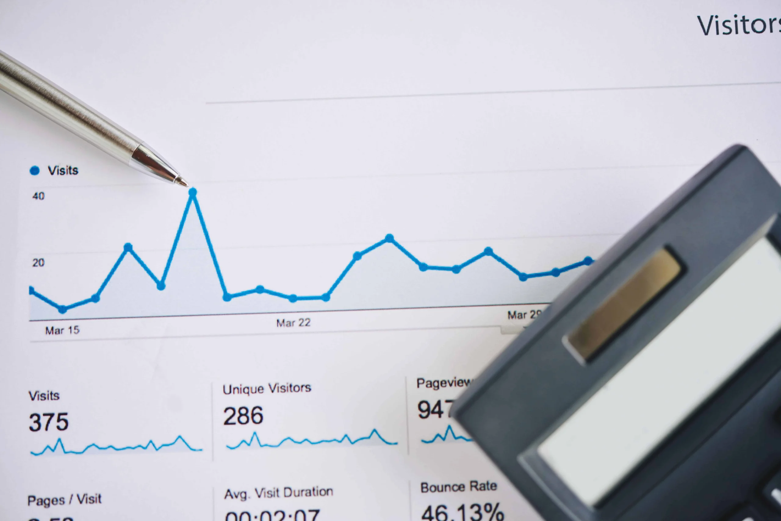
You’re getting plenty of visitors, but your website isn’t turning clicks into customers. This gap between high traffic and low conversions often hides behind common, fixable issues. In this post, you’ll learn the 12 biggest conversion blockers and practical steps to fix them, helping you turn more visits into sales. Let’s explore what might be holding your site back and how SolidifyWeb’s CRO audit and web development services can help you break through. For more insights on why your website traffic might not be converting, check out this article.
Understanding Conversion Barriers

A high number of visitors is fantastic, but not if they’re leaving without taking action. Let’s dive into what might be causing this disconnect and how you can spot these problems.
High Traffic, Low Conversions
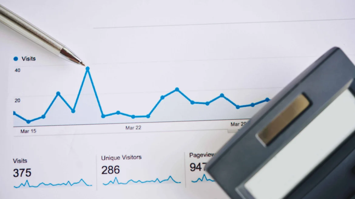
You might notice your site has plenty of visitors, yet few are converting into customers. This situation can be frustrating, leaving you wondering what’s going wrong. Often, it’s not about the quantity of traffic, but the quality of engagement. Your website might be generating interest but failing to guide visitors toward meaningful actions. This can occur if your content doesn’t resonate with your audience or if the navigation is unclear. Addressing these areas can encourage users to stay longer and interact more with your site.
Common Conversion Blockers
Several issues can prevent visitors from converting. A cluttered layout is a big offender, as it overwhelms users and makes it hard to find important information. If your pages load slowly, this can frustrate visitors, leading them to abandon your site in favor of a competitor. Another common hurdle is a lack of clear call-to-action (CTA) buttons. Without them, visitors may not know what steps to take next. It’s also crucial that your site appears trustworthy. Elements like outdated design or missing contact details can erode trust quickly, sending potential customers elsewhere.
For a deeper understanding of why visitors might not be converting, take a look at this comprehensive guide.
Recognizing Trust Signals
Building trust is essential for conversions. Visitors want to feel safe and confident that their data is secure. Displaying trust signals, such as SSL certificates and customer testimonials, can help establish credibility. Clear privacy policies and visible contact information also reinforce trust. When visitors see that others have had positive experiences with your brand, they are more likely to convert. Incorporating these elements strategically can create a more reliable and inviting space for users to engage with your business.
Practical Fixes for Conversion Issues

Now that we’ve identified the barriers, let’s explore actionable solutions. These adjustments can significantly improve your conversion rates and user satisfaction.
Call to Action Optimization
The placement and wording of your CTAs can make or break a conversion. Ensure your CTAs are visible and compelling. Use action-oriented language that encourages users to click, like “Get Started” or “Learn More.” It’s also vital to position CTAs strategically throughout your website. They should stand out visually, using contrasting colors and large buttons that draw the eye. Testing different variations can help you find what resonates most with your audience, leading to higher engagement and conversions.
Page Speed and Mobile-First Design
With more users accessing websites via mobile devices, having a mobile-friendly design is crucial. Your site should load quickly and adapt seamlessly to various screen sizes. Google prioritizes mobile-first design, which can also boost your search rankings. To improve speed, compress images and eliminate unnecessary scripts. Use tools to analyze your site’s load time and make adjustments as needed. Faster loading speeds enhance the user experience, reducing bounce rates and keeping visitors engaged longer.
Leveraging A/B Testing and Heatmap Analysis
Understanding user behavior through data is invaluable. A/B testing allows you to compare different versions of a webpage to see which performs better. This method can reveal which elements drive conversions and which need tweaking. Heatmaps provide visual representations of where users click most, helping identify areas of interest or neglect. By analyzing this data, you can make informed decisions to optimize your site, ensuring it meets user needs and maximizes conversion potential.
To delve deeper into conversion strategies, explore this detailed resource.
Partnering with SolidifyWeb
Ready to enhance your website’s performance? Here’s how SolidifyWeb can help you achieve your conversion goals effectively.
Local SEO and Web Development Ogden
SolidifyWeb specializes in boosting local visibility for businesses in Ogden. By optimizing your site for local searches, we help you connect with nearby customers. Our web development services ensure your site is not just attractive, but also functional and optimized for search engines. This dual approach increases your chances of being found by the right audience and keeps them engaged once they land on your site.
Custom CRO and UX Design Solutions
We offer tailored solutions to meet your unique business needs. Our conversion rate optimization services focus on improving user experience and increasing conversions. By analyzing user behavior and implementing strategic changes, we enhance the overall effectiveness of your website. Our UX design services create intuitive, user-friendly interfaces that guide visitors smoothly through your site, encouraging them to take desired actions.
Book Your Free Conversion Audit
The longer you wait, the more potential customers you might lose. Take the first step towards improving your website’s conversion rates by booking a free conversion audit with SolidifyWeb. Our experts will assess your site’s performance and provide actionable insights to help you achieve your business goals. Unlock the full potential of your website and turn visitors into loyal customers with our expert guidance and support.
For more insight into why traffic might not be converting, check out this discussion on Reddit.
By applying these practical solutions and partnering with a trusted expert like SolidifyWeb, you can transform your website into a powerful tool for growth and conversion. Focus on providing a seamless, engaging experience for your users and watch your conversion rates improve steadily.
Let’s take care of your website today