Posts Tagged :

mobile SEO

Mobile Optimization Best Practices to Supercharge SEO — A SolidifyWeb Playbook 1024 682 ignacio@mcval.net

Mobile Optimization Best Practices to Supercharge SEO — A SolidifyWeb Playbook

Mobile Optimization Best Practices to Supercharge SEO — A SolidifyWeb Playbook

Mobile SEO is no longer optional if you want to stay competitive. Slow loading times and poor mobile UX chase away visitors before they even see your content. This guide breaks down proven mobile optimization tactics that improve Core Web Vitals, boost page speed, and enhance your site’s search rankings. Keep reading to learn how SolidifyWeb helps businesses like yours nail mobile-first indexing and technical SEO with real results. Learn more.

Mastering Mobile SEO

The importance of mobile SEO continues to grow as users rely more on their phones. Let’s dive into the key elements that make your mobile presence shine, starting with responsive web design.

Responsive Web Design Essentials

Creating a responsive web design ensures that your site looks great on any device. This means your site will automatically adjust to fit screens of all sizes. Imagine browsing a website that cuts off text or images on your phone; this is what you want to avoid.

  • Fluid Grids: Use percentage-based grids that adapt to different screen sizes. This flexibility is crucial.

  • Flexible Images: Ensure images scale well within their containers. This prevents awkward stretching or cropping.

  • CSS Media Queries: These allow you to apply different styles based on the device’s characteristics. They’re the backbone of responsive design.

Responsive design not only improves user experience but also boosts your mobile SEO. Search engines prioritize mobile-friendly websites. Make sure your site scores high on user accessibility, and you’ll see improvements in your search rankings.

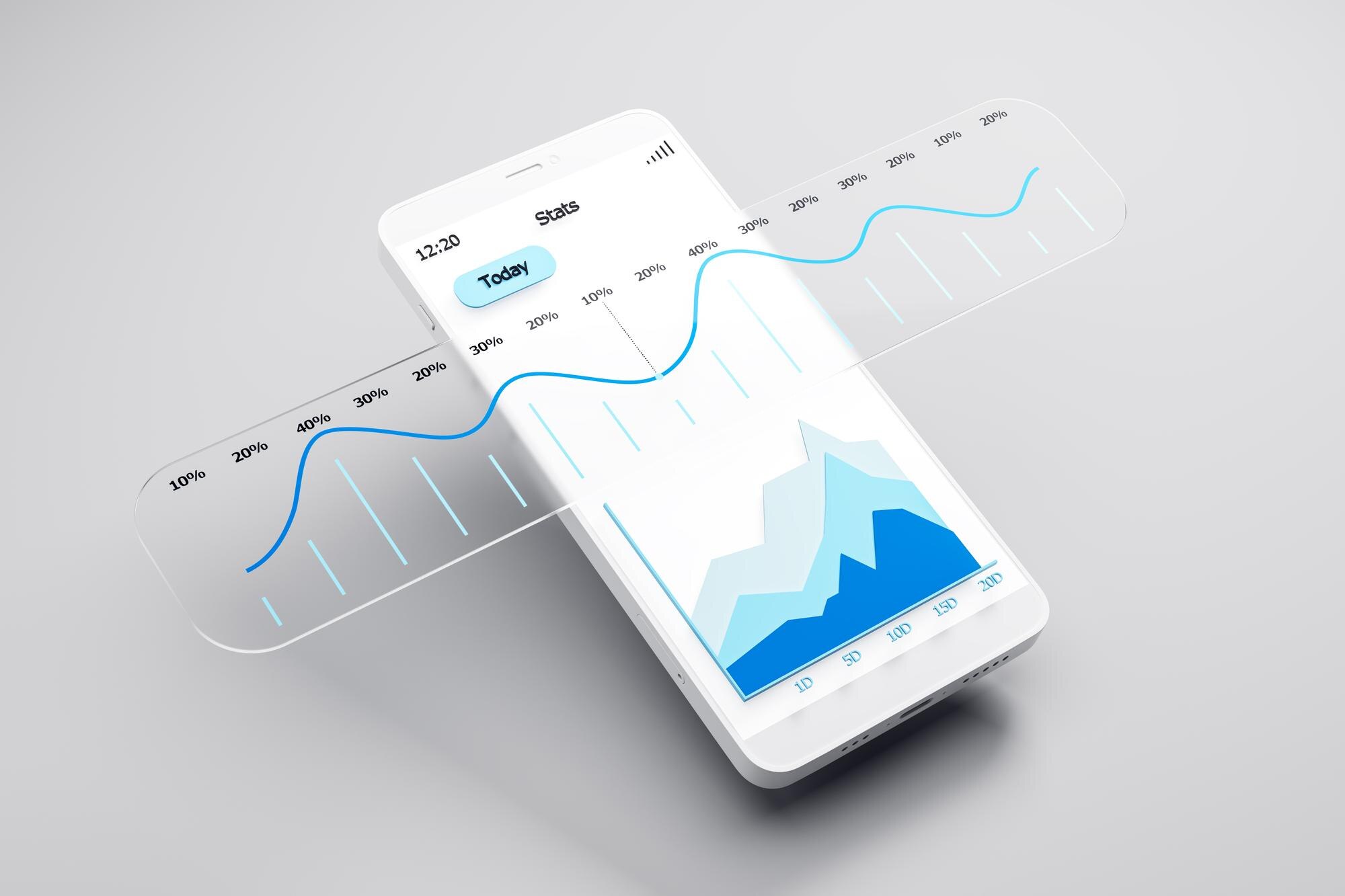
Speed and Core Web Vitals

Page speed is a critical factor for mobile success. Google considers Core Web Vitals as essential metrics for evaluating page experience.

  • Largest Contentful Paint (LCP): Measures loading performance. Aim for LCP to occur within 2.5 seconds.

  • Cumulative Layout Shift (CLS): Focuses on visual stability. Keep CLS below 0.1 to ensure content doesn’t shift unexpectedly.

  • Interaction to Next Paint (INP): Assesses responsiveness. Quick interactions lead to better user satisfaction.

Improving these metrics keeps visitors on your site longer and can enhance conversion rates. Use tools like PageSpeed Insights to track your progress and identify areas for improvement. Optimizing speed isn’t just about keeping users happy; it directly impacts your site’s search rankings. Explore more on mobile-first indexing.

Technical SEO for Mobile

With a strong foundation in design and speed, let’s focus on technical SEO aspects. These tactics will further optimize your site’s performance on mobile devices.

Image Optimization and Lazy Loading

Images play a big role in your site’s performance. Here’s how to make them work for you:

  • Use WebP and AVIF Formats: These formats offer better compression than JPG or PNG, reducing file sizes without sacrificing quality.

  • Implement Lazy Loading: Delay loading images until they’re about to appear on the screen. This reduces initial load time and saves bandwidth.

Imagine visiting a site that loads in seconds because images load only as needed. This keeps users engaged and improves your page speed metrics. Faster loading times lead to happier users and better rankings.

Prefetch and Preconnect Tactics

Some background tasks can be done ahead of time to speed up your site:

  1. Prefetch: This technique fetches resources you’ll likely need soon, like critical CSS or JavaScript.

  2. Preconnect: Establish early connections to servers, reducing latency. This helps speed up resource loading.

When these strategies are applied, your mobile website becomes a seamless experience. Users appreciate pages that load smoothly, which reflects positively in search results.

Enhancing Mobile User Experience

A positive user experience keeps visitors on your site longer. Let’s explore some best practices and local SEO strategies to boost engagement.

Best Practices for Mobile UX

Your mobile website should be intuitive and user-friendly. Here are some tips to improve mobile UX:

  • Simplify Navigation: Use clear menus and easy-to-find buttons. A clutter-free interface helps users find what they need quickly.

  • Readable Text: Ensure fonts are large enough and contrast well with the background. This enhances readability.

  • Touch-Friendly Elements: Make sure buttons and links are easy to tap. Avoid elements that are too small or too close together.

By following these practices, users will find your site enjoyable and easy to use. This encourages them to explore more, increasing the chance of conversions. Check out more insights on improving mobile UX.

Local SEO Strategies in Ogden

For businesses in Ogden, local SEO is key to attracting nearby customers. Here’s how to optimize locally:

  • Google Business Profile: Ensure your profile is complete and accurate. This helps in appearing in local searches.

  • Local Keywords: Use terms specific to Ogden in your content. This boosts local relevance.

  • Citations: Ensure your business details are consistent across online directories.

These strategies help your business stand out in local search results, making it easier for potential customers in Ogden to find you. Local SEO boosts your visibility and drives traffic, which can lead to more sales and growth. Discover more about local SEO tactics.

By implementing these strategies, your business can excel in the digital landscape. SolidifyWeb is here to help you achieve these goals with our expertise and tailored solutions, ensuring your success in the competitive world of mobile SEO.

Let’s take care of your website today

Mobile Optimization: The Make-or-Break Factor for SEO Success in 2026 1024 684 ignacio@mcval.net

Mobile Optimization: The Make-or-Break Factor for SEO Success in 2026

Mobile Optimization: The Make-or-Break Factor for SEO Success in 2026

Mobile optimization is no longer optional for your website—it’s the deciding factor in SEO success for 2026. Google’s mobile-first indexing and Core Web Vitals like INP, LCP, and CLS now shape search rankings more than ever. In this post, you’ll see how SolidifyWeb tackles mobile SEO challenges head-on to boost your site’s speed, stability, and user experience, helping your business thrive on every device. For more on this topic, check out this guide on mobile optimization.

The Mobile-First Imperative

Understanding the shift toward a mobile-first world is crucial for SEO success. Let’s explore how this impacts user interaction on your site.

Mobile SEO and User Experience

Your website’s performance on mobile devices directly affects user satisfaction. Sites that load quickly and behave smoothly make users happy. This is important because Google uses mobile-first indexing, where your mobile site’s performance can impact your search ranking. If users struggle to navigate or if pages load slowly, visitors leave, hurting your site’s reputation.

To combat this, prioritize mobile optimization. A well-optimized site not only retains visitors but also encourages longer visits. Engage your audience by ensuring easy navigation and fast page loads. SolidifyWeb specializes in creating such efficient, user-friendly designs. With our help, you can transform casual browsers into loyal customers.

Core Web Vitals: INP, LCP, CLS

Core Web Vitals are essential metrics for monitoring website health. They include three main components: INP (Input Delay), LCP (Largest Contentful Paint), and CLS (Cumulative Layout Shift). These factors determine how swiftly and smoothly your site responds to user actions. Envisionit Agency provides insights into these metrics’ future importance.

Focusing on these metrics can improve user interaction. For instance, minimizing Input Delay ensures users don’t get frustrated with slow responses. Keeping Layout Shifts minimal prevents unexpected movements on your site, maintaining a seamless experience. SolidifyWeb helps you tackle these challenges, enhancing your mobile site’s performance and stability.

Tackling Mobile SEO Challenges

Addressing mobile SEO involves understanding technical requirements and refining design strategies. Let’s delve into solving common issues.

Technical SEO and Mobile-First Indexing

Technical SEO is about optimizing your site for both search engines and users. With mobile-first indexing, Google primarily evaluates the mobile version of your site to rank pages. This means any technical issues on your mobile site can impact your overall ranking. Bright SEO Tools offers a checklist to tackle these challenges.

SolidifyWeb’s expertise includes resolving technical issues like slow load times and unresponsive design elements. Our team conducts thorough audits to identify and fix potential problems, ensuring your site is indexed correctly. By focusing on technical SEO, we help you maintain a robust online presence, crucial for staying ahead in search rankings.

Responsive Design and Page Speed

A responsive design ensures your site looks great and functions well on any device. It adapts to different screen sizes, offering a consistent user experience across platforms. Coupled with page speed optimization, this approach is key to minimizing bounce rates and keeping users engaged.

Fast page loads are non-negotiable. Studies show that a one-second delay can reduce conversions by 7%. SolidifyWeb employs strategies like image optimization and leveraging CDNs to boost your site’s speed. Our responsive designs enhance user engagement, providing a seamless browsing experience that encourages visitors to explore further.

SolidifyWeb’s Comprehensive Solutions

SolidifyWeb offers solutions that cover every aspect of mobile SEO. Let’s explore how our services can elevate your business’s digital presence.

End-to-End Mobile SEO Services

Our mobile SEO services ensure your site excels in performance and user satisfaction. We start with an in-depth analysis of your current setup, identifying areas for improvement. Then, we implement strategies tailored to your needs, including JavaScript SEO, schema markup, and server-side rendering.

Our approach guarantees your site is not only fast but also accessible. We consider ADA accessibility to ensure inclusivity. By focusing on these elements, SolidifyWeb helps you stay competitive in a search landscape that’s increasingly focused on mobile metrics.

Local SEO Ogden and Enterprise Support

SolidifyWeb is your go-to partner for local SEO in Ogden. We specialize in optimizing your online presence to attract local customers. By enhancing your Google Business Profile and employing location-specific keywords, we ensure you appear in relevant searches.

For enterprise clients, we offer scalable solutions that integrate seamlessly with existing systems. Our commitment to quality and performance means you can trust us to manage complex projects with ease. Whether you’re a small business or a large corporation, our expertise can drive your digital growth.

Conclusion

In 2026, your business’s success hinges on mastering mobile optimization. With SolidifyWeb’s comprehensive services, you gain a partner dedicated to enhancing your mobile SEO. Embrace the future with confidence, knowing your site is ready to meet the demands of tomorrow’s digital landscape.

Mobile Optimization and SEO: How a Mobile‑First Experience Drives Rankings 1024 344 ignacio@mcval.net

Mobile Optimization and SEO: How a Mobile‑First Experience Drives Rankings

Mobile Optimization and SEO: How a Mobile‑First Experience Drives Rankings

Mobile optimization isn’t just a nice-to-have—it’s a must for climbing search engine rankings today. Google’s shift to mobile-first indexing means your site’s mobile usability and Core Web Vitals like Largest Contentful Paint (LCP) and Cumulative Layout Shift (CLS) now shape your visibility. In this post, you’ll learn how to improve your mobile SEO with actionable steps that boost page speed and user experience, helping your business stand out online. For more insights on mobile optimization, check out this guide.

Understanding Mobile Optimization

Mobile optimization is the key to unlocking higher search engine rankings. When your site is mobile-friendly, it’s more accessible to users, which search engines love. But what does this mean for your business?

Impact on Search Rankings

A mobile-friendly website significantly boosts your search ranking. Google prefers sites that load quickly and look great on any device. If your site adapts well to mobile, you’re more likely to appear higher in search results. A site that isn’t optimized may lag behind. Users often leave slow-loading pages, which leads to a higher bounce rate. This can hurt your rankings over time.

Benefits of Responsive Web Design

Responsive web design ensures your site looks good on any device, whether it’s a phone or a desktop. This increases user satisfaction, leading to longer site visits and more engagement. A well-designed site can lead to more conversions. When users enjoy their visit, they’re more likely to explore your services. This can turn visitors into loyal customers. Plus, responsive design reduces maintenance costs since you’re managing one site instead of multiple versions.

Google’s Mobile-First Indexing

Google’s focus on mobile-first indexing means it evaluates the mobile version of your site first. This shift underscores the importance of mobile optimization even more.

Importance of Core Web Vitals

Core Web Vitals are essential metrics that measure user experience. They focus on page loading, interactivity, and visual stability. These elements are crucial for ranking. If your mobile site excels in these areas, you’ll have a competitive edge. Ensuring a smooth user experience can lead to better engagement and retention. Interested in learning more about these metrics? Here’s a detailed explanation on Core Web Vitals.

Key Metrics: LCP, CLS, INP

The Largest Contentful Paint (LCP) measures loading performance. A fast LCP means users see your content quicker. Cumulative Layout Shift (CLS) assesses visual stability. A low CLS indicates a stable layout, enhancing user experience. Interaction to Next Paint (INP) focuses on interactivity. Quick response times improve usability. These metrics are vital for keeping users happy and improving your site’s ranking.

Actionable Steps for Mobile SEO

Improving your mobile SEO doesn’t require an overhaul. Small, strategic changes can make a big difference.

Conducting a Technical SEO Audit

Start with a technical SEO audit to identify and fix issues. Check for slow load times, broken links, and mobile usability problems. Addressing these can boost your rankings significantly. Use tools like Google’s Mobile-Friendly Test to see how your site performs. This insight is invaluable for making targeted improvements. Learn more about supporting your SEO strategy with mobile optimization.

Enhancing Mobile Usability and Page Speed

Enhancing usability and page speed is crucial. Optimize images with lazy loading techniques to improve load times. Implement a content delivery network (CDN) to deliver content faster. These steps can drastically reduce page load times. Simplifying site navigation and reducing clutter also enhance usability. These improvements make your site more attractive to both users and search engines. For additional tips, visit this article on mobile SEO.

Remember, the longer you wait to optimize, the more potential customers you might lose. By focusing on mobile optimization, you not only improve your search rankings but also offer a better experience for your users. SolidifyWeb is here to help you navigate these changes and ensure your site is performing at its best.

    Join our Newsletter

    We'll send you newsletters with news, tips & tricks. No spams here.

      Contact Us

      We'll send you newsletters with news, tips & tricks. No spams here.